Description
Curving text is one of the most essential skills in graphic design, instantly transforming standard typography into dynamic logos, badges, and artistic compositions. Whether you need to wrap a slogan around a circular emblem or create a wavy title that flows with an image's background, Adobe Photoshop offers versatile tools to handle the job. This skill allows you to break away from rigid grid layouts and add organic movement to your designs.
While the concept might seem complex to newcomers, Photoshop provides two distinct ways to achieve this effect: a quick preset method for simple bends and a precision-path method for total control. By mastering both techniques, you will have the flexibility to handle everything from quick social media graphics to professional branding projects.
What You'll Need
To follow along with this guide, you should have the following ready:
- Adobe Photoshop installed: Any CC version from 2020 to the present (2026) works perfectly, as these core features are stable.
- A mouse or trackpad: While a graphics tablet is nice, a standard mouse is actually easier for the precise clicking required for path anchors.
- Basic familiarity with layers: Knowing how to select and move layers in the Layers Panel will help you navigate the steps faster.
Step-by-Step Guide
We will cover two methods. Method 1 is best for simple arcs (like a college t-shirt design). Method 2 is best for placing text on circles or custom waves (like a stamp or logo).
Method 1: The Warp Text Tool (Quick & Easy)
This method uses built-in presets to bend your text. It remains editable, meaning you can change the words later without losing the curve.
- Select the Type Tool: Press (T) on your keyboard or click the Horizontal Type Tool icon in the toolbar.
- Create Your Text: Click anywhere on your canvas and type your desired phrase. Press the Checkmark in the options bar (or press Ctrl+Enter) to commit the text.
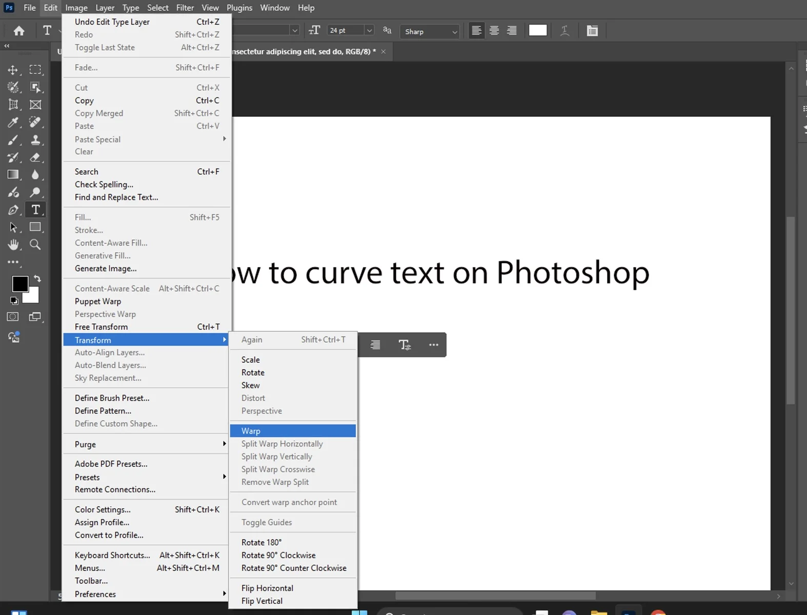
- Open the Warp Menu: With your text layer still selected, look at the top Options Bar. Click the icon that looks like a T with a curved line underneath it (Create Warped Text).
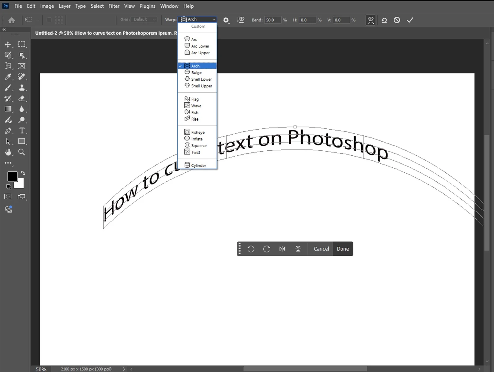
- Choose a Style: A dialog box will appear. Click the dropdown menu next to "Style" (it usually says "None" by default). Select Arc for a standard curve.
- Adjust the Curve: detailed sliders will appear:
- Bend: Controls the intensity of the curve. Drag it to the right for an upward curve or left for a downward curve.
- Horizontal Distortion: Makes one side of the text larger than the other, creating a 3D perspective effect.
- Finalize: Click OK when you are happy with the shape. You can still double-click the text layer thumbnail to edit the spelling or font later.
- Bend: Controls the intensity of the curve. Drag it to the right for an upward curve or left for a downward curve.
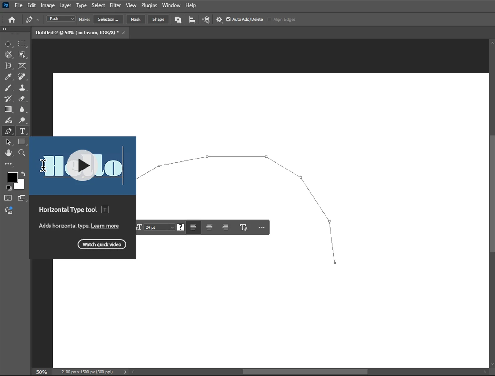
Method 2: Type on a Path (Professional Control)
For total control—such as writing text around a perfect circle or a custom squiggly line—you need to use a "Path."
- Select a Shape or Pen Tool:
- For a circle: Press (U) to select the Ellipse Tool.
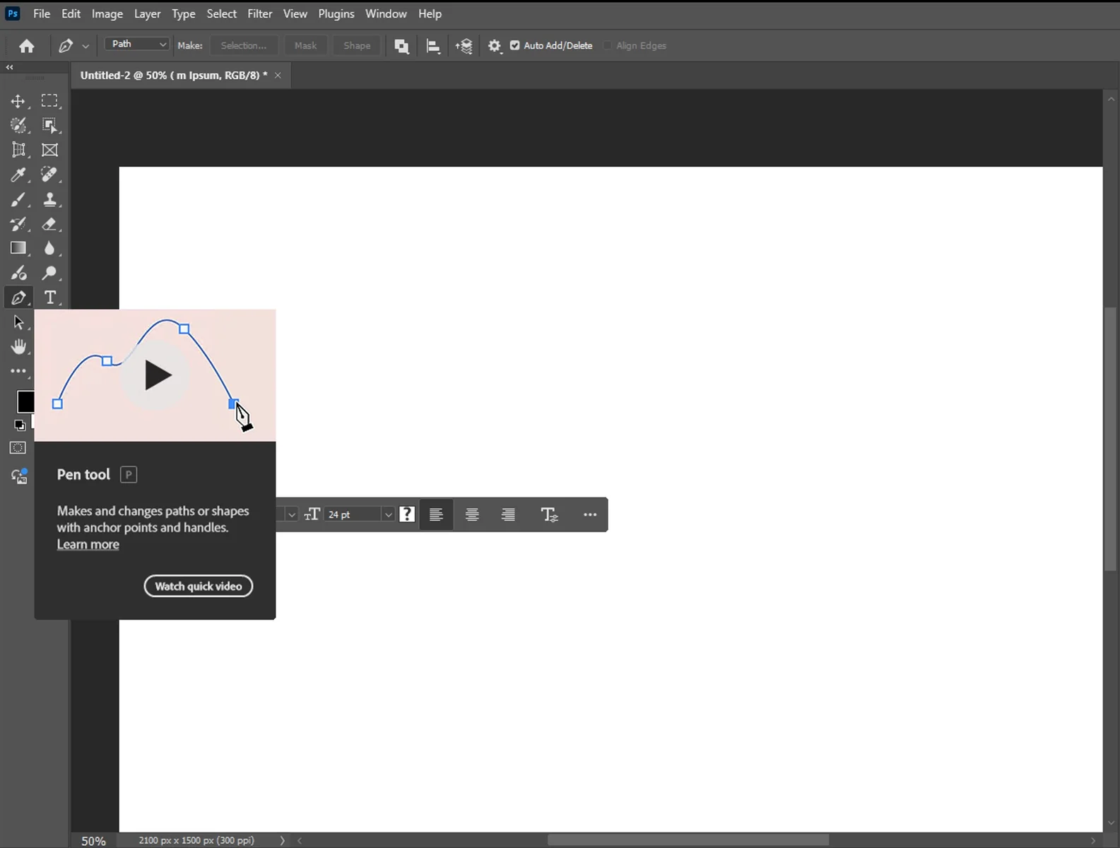
- For a custom wave: Press (P) for the Pen Tool.
- Set Mode to 'Path': This is the most critical step. In the top-left Options Bar, change the dropdown menu from "Shape" to Path. This ensures you draw a guide line, not a filled colored shape.
- Draw Your Path:
- Ellipse: Hold Shift and drag on the canvas to create a perfect circle.
- Pen: Click and drag to create anchor points that form a curved line.
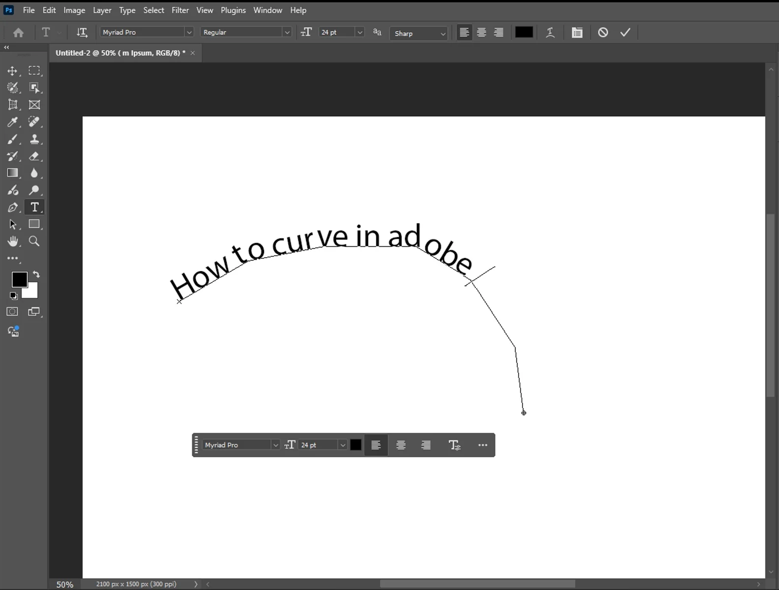
- Activate the Type Tool: Press (T) again to switch back to the Type tool.
- Hover and Click: Move your cursor directly over the path line you just drew. You will see the cursor icon change from a square box to a curved wavy line. Click once.
- Type Your Text: Your text will now stick to the line. Type your phrase.
- Adjust Position: Select the Path Selection Tool (Press A—it looks like a black arrow).
Hover over your text. You will see the cursor change to an I-beam with a small arrow. Click and drag the text along the line to rotate or center it.
Tips for Better Results
- Adjust Tracking (Letter Spacing): Curved text often squishes letters together at the bottom of the curve and spreads them apart at the top. Open the Character Panel (Window > Character) and increase the Tracking value (the VA icon) to improve readability.
- Flip Text Inside the Circle: If you are making a stamp and need text on the bottom half of the circle, use the Path Selection Tool (A) and drag the text inside the circle. It will flip upside down and snap to the interior of the line.
- Hide the Path: Once you are done, the thin blue path line might remain visible while you work. Press Ctrl+H to toggle visibility of extras, or click on a different layer to hide the path outline.
- Center Alignment: When typing on a path, set your paragraph alignment to "Center" in the Options Bar. This makes it significantly easier to position the text perfectly at the top or bottom of a circle.
Common Mistakes to Avoid
- Using 'Shape' Instead of 'Path': If you draw a circle and it fills with color, you didn't change the tool mode to "Path" in the Options Bar (Step 2 of Method 2). Delete the layer and try again.
- Distorted Letters: Using the Warp tool (Method 1) can sometimes stretch your letters vertically, making them look unnatural. If the text looks too tall, use the Character Panel to lower the Vertical Scale to 90% or 95% to compensate.
- Unable to Move Text on Path: Beginners often try to move text on a path using the Move Tool (V). This will move the whole layer. You must use the Path Selection Tool (A) to slide text along the curve without moving the path itself.

How to Circle Text in Photoshop: A Simple Tutorial

How to Feather Edges in Photoshop: Easy and Fast Techniques